Colorado Avalanche
How do we feel about the new Avalanche road uniforms?

First off, I don’t really know why anyone would have ever wanted to mess with the first Avalanche road uniform colors:
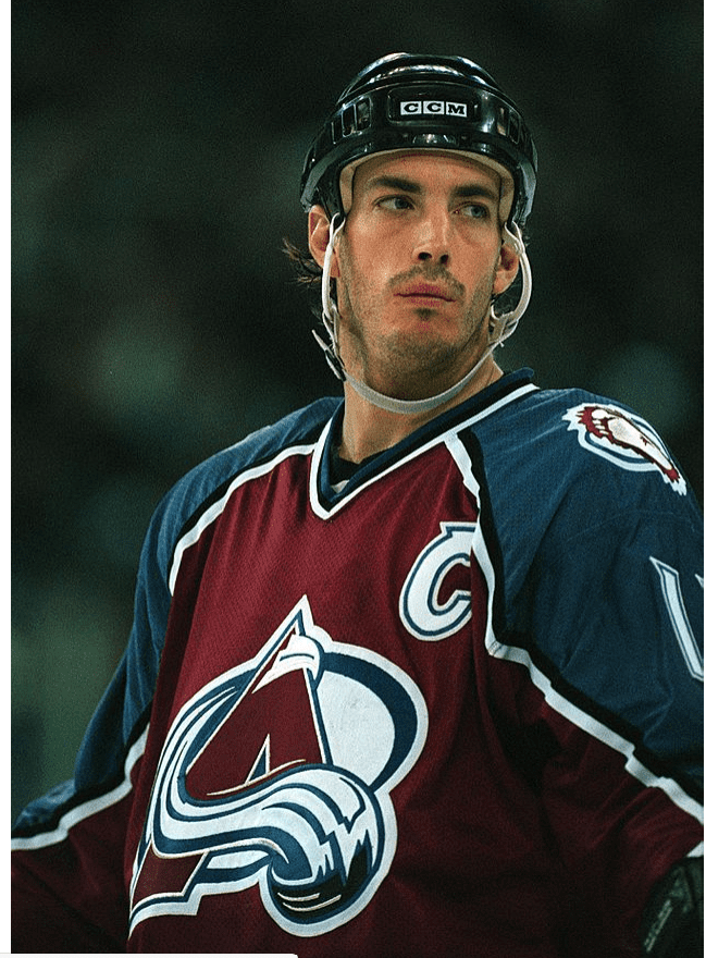
I loved those old Avs road unis. Burgundy wine color, royal blue trim. Very, very striking to the naked eye. But, starting however many years ago it was when some marketing people tried to fix what wasn’t broken, NHL teams made the choice to go with white uniforms for road games. I disagreed with that then, and I disagree with it now. Why try to do keno strategies on a sure thing? But beside that point, the Avs have tinkered with their road colors for many years now. And, this is the latest version:
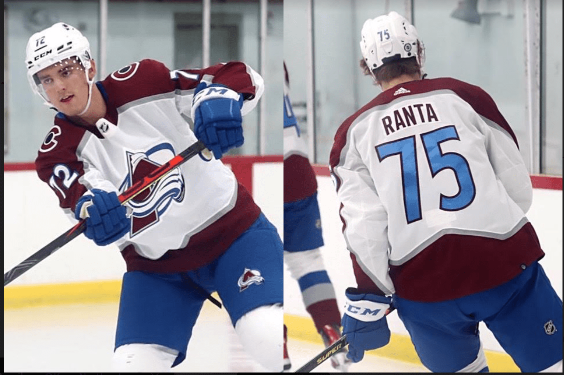
These are, officially, the new Avalanche road uniforms for 2021-22. The changes from last year are blue numbers/lettering and burgundy nameplates.
I um, uh….yeah, I don’t like them too much. Aqua blue is actually my favorite color under the rainbow, but I never quite expected the Avs to mimic the look of the Miami Dolphins. I much prefer the older look of the Avs on the road, but since the NHL decided to make the road villains dressed in white, that has been off the table.
I don’t really love the blue number coloring. It looks a bit like your uncle who dressed up for the wedding reception in completely mismatched colors, and while everybody kind of laughed under their breath at him, nobody really wanted to go up and tell him, “Let’s maybe think about a new shirt here…”
They look like cheap knockoffs from an overseas sweatshop that you see for sale on Ebay a lot.
The Avalanche home uniforms still look like their old road uniforms, except the burgundy isn’t as bright. I liked the flashier, more ’90s flash of burgundy than the one now.
Then again, I suppose I’ll be called “old” here by some over this opinion. But what about you, my hardcore Avs fans and subscribers? I’d like to hear your opinion on this issue too.
Those colors are ugly as hell…
They switched to white road jerseys because of all the use of alternate jerseys at home. This way the road team only had to bring the white jerseys instead of bringing 2 on the road, depending on if a club was using their 3rd (or now a 4th reverse retro) jersey, which is generally never just a white jersey. As far as the new ones, complaining about blue numbers does seem like an “old man yells at cloud” scenario. As a graphic designer, I can understand why they would start to implement more of the Nordiques blue since they’re going… Read more »
Uhmm, it helps since they went to the blue pants/gloves but yeah..
The blue numbers are … different. At least it matches the pants and gloves now, although I think the burgundy pants and gloves would have looked so much better for the road set. AD – I’m with you about preferring white jerseys at home and color jerseys on the road but as a poster earlier noted, the introduction of 3rd jerseys was the reason for this change. A nice compromise would be the concept I think the NHL did a while back, or maybe it was the AHL, of first half of the season do whites at home and color… Read more »
Yes! Burgandy pants and gloves would be so much better!
It’s all about making peeps buy new shirts. Follow the dollar. Color scheme is horrid
Yuck, not as bad at the apron design but still being back the old uniforms, numbering and all.
Someone needs to learn about basic graphic design and how it applies to color choices.
If the numbers are going to be that color then the NAME needs to be that color. Oh well…..
Yuck – that blue is nasty!
I’m ok with trying something new and this goes well with blue pants I guess. We’ll see how it’ll look in game action. The 90’s mesh jerseys like in the Sakic photo were the best for sure. Ironicly they won the Cup first year after they gave those up.. The shiny material made the mesh jerseys look awesome in flash light but the burgundy was naturally pretty dark in them too. They should bring the mesh back! But also the great reverse retros from last season. The worst ones were the Reebok Edges that they had from 06-07 until Adidas… Read more »
Not my favorite for sure — Liked the burgundy numbers much better. Looks weird with burgundy names too.
The numbers were black not burgundy
Thanks Erkel. Either way I don’t like them.
I sort of like the new brighter blue they’re bringing into the whole scheme. Way more interested in when they might release some more of the Reverse Retros though…
I’d rather see the full Nordiques colors as I think they look great. They’re going halfway between the Avs and Nordiques uniforms, which never works. It’s like a bad tie or loud colored socks – – it sticks out like a sore thumb
I have been hitched up to the Avalanche wagon since ’96 but never liked the logo or colors much… The alternate uniforms are usually the ones I like. And last year’s outdoor uniform is dope AF.
I guess I’m going to save some money, not buying a new sweater this season.
Bring back the foot patch and make Eddie the Yeti the official mascot.
The new road uniforms? mark me as a no. But a uniform question, are they going to produce any more of the Nordic inspired 3rd jerseys for this year? Failed to move fast enough last year to get one and can not find one any where now. just wondering.
The original was superb. Cool typeface and the colors were professional. I thought they looked great in a league where many teams looked like they were playing in kids’ pajamas. Now they’ve joined those ranks.
I”m more interested in how they play than the color of their uniform numbers. Seems like a childish thing to worry about!
It wouldn’t be that bad if they added a blue line along with the silver one, just like they did with the black with the original jerseys.
Honestly, I would have gone with the burgundy numbers, but these aren’t that bad. I honestly never understood why they had so much black in their uniforms in the first place (pants, gloves, and helmets) when black is not one of their stated colors. I do prefer the idea of using burgundy for all of those things, but the blue is better than black in my ever so humble opinion.
Just need burgundy helmets, gloves and pants. Would look fantastic!
Good God I hope someone got fired for that blunder. How about keep the burgandy theme with burgandy pants and gloves, black numbers? Jeez, these are horrible.
Hate the blue pants and gloves (especially on the away threads). One of the reasons being that there was no other prominent blue. I prefer the black letters and numbers but if they’re intent on the blue gear then…
I had to look at many photos of last year home and road; honestly if you had not mentioned it I likely wouldn’t have noticed a difference. Besides, who really cares? We get to watch them play – MacKinnon, Makar, Landy and Rantanen – make the unis out of burlap for all I care.
I like them! The colours are Avs colours and they better match the jesery and pants. And black has now been eliminated. Which was never part of the Avs colour palette anyway.
[…] How do we feel about the new Avalanche road uniforms? […]
The black looked awful with the new pants. It made no sense to have black numbers and letters when there was zero other black remaining in the uniform. This has to be done.
[…] How do we feel about the new Avalanche road uniforms? […]
They made a change that completely avoids addressing the issue with the road look which is that awful combo of blue gear with burgundy tailed and sleeved jersey. Here is my (very low quality photoshop) mock up of what the road look should be. It addresses removing the black, includes roughly equal amounts of both burgundy and blue, as well as fixing the jarring mismatch of jersey to pants and gloves. It should keep the back numbers blue with burgundy outline and make the sleeve numbers white with burgundy outline, helmet numbers should be white, which I don’t think really… Read more »
I’d be ok with the name plate being Burgundy. But they should have kept the black and gone with the Burgundy pants instead. These look like some cheap POS fake you buy on eBay.
Its shit.
It’s the blue pants and gloves that mess up the look, go back to black! Or go play in the ECHL
I hate them so much. I hated the blue pants and gloves last year. I was so happy they were going away. But now not only are the blue pants here to stay but the blue numbering as well. It’s as visually offensive as it is unnecessary.
I dislike the blue lettering, I love the white as a road jersey because I feel the burgundy is the natural look and should be worn in your own house, but what they’ve done to tinker lately I don’t love… miss the black pants and black lettering too much colour now