
I ‘turned the page’ last week. But, like all of my reading assignments in high school and college, my mind wandered and I didnt retain any of the information, so I’m turning the page back to go over it one more time.
Just one more time… for one more day… let’s look back and enjoy the last two things that remained in celebrating 2022. Last night’s ring ceremony and tomorrow night’s banner raising. Then it’s all about 2022-23. We can finally turn the page… again.
The players from last year’s Avalanche team (and Jack Johnson in town early with Wednesday’s opponent, the Blackhawks) got their 2022 Stanley Cup Championship at a private event on Monday night.
Dater covered all the details of the ring from the team’s release last night. The number of diamonds, the meaning behind the numbers, the details of the ring, etc.. He has you covered for that.
What I want to examine is where this ring ranks against the last 10 Stanley Cup winners’ rings. Rankings are fun, not at all arbitrary and spark nothing but positive feedback and civil discourse! So here I go with my TOTALLY CORRECT rankings of the last decade of championship rings.
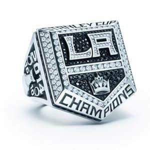
- 2014 Los Angeles Kings
Initially, I liked this one because it’s different and outside the box a bit with the ring’s shape mimicking that of the team’s logo. I think because this was their second title in three years, the Kings were able to be different with this one and make it stand out. However, when I looked over all 10 together, this one stood out and not in a good way. It was such an outlier that I just didn’t really like it, which is a shame because those Kings teams were fun and really good.
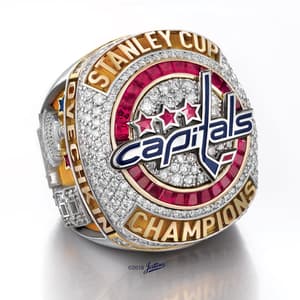
- 2018 Washington Capitals
This list is hard after No. 10 because the rings are all basically the same, save for some of those personal touches that reflect the organization and its history. This is a ring that was a long time coming for a long suffering franchise. It just missed the mark for me. That Capitals logo… stinks if we’re being honest (second worst in the league after the Ducks). To have that be the primary look on the ring and not have the Stanley Cup featured prominently behind it is a missed opportunity. There are several instances of gold being used in these rings, but the teams who have it also have gold/yellow in their color scheme. The prominence of gold on this ring against the red, white and navy of the team’s brand seems to clash and doesn’t work.
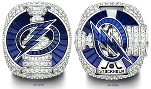
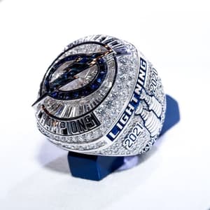
- 2020 Tampa Bay Lightning*
The Covid Cup. I don’t know. At the time I wanted Tampa to win because I liked Stamkos and, moreover, I didn’t want Dallas to win. But time — and watching the constant complaining of the Lightning in this past spring’s run to the Final — soured me on Tampa. Fairly or unfairly, their ring takes a hit for me because of that exhaustion. In reality, it’s not a bad ring, but the spinning logo and the Stockholm symbolism for “where they came together as a team” is just cheese. It should’ve said “Columbus” to remind them of their embarrassing loss the year before that motivated them to get their act together in the playoffs and not bow out to inferior teams after a historic season.
- 2021 Tampa Bay Lightning
“Who on Tampa hurt you, Pat?” NO ONE! But here’s another gimmick ring. The actual design of the ring is pretty cool. The logo is awesome and the way that the stones reflect the team’s rebrand to just the two colors is very cool. Where my eyes rolled so far back into my head is the fact that the top is basically a doorway to a college girl’s dorm room with just a bunch of inspirational words. By my count, they shoehorned in five phases inside this little book masquerading as a championship ring. In the words of Shoresy: “figure it out.”
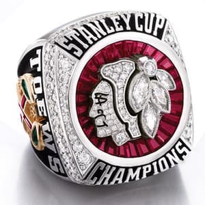
- 2013 Chicago Blackhawks
You know what? I nothing this ring. I don’t hate it. I don’t love it. I nothing it. It’s fine. Moving on.
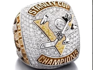
- 2017 Pittsburgh Penguins
The Penguins once again best their rivals from Washington. Not on the ice this time, but in the proper place to use gold on a Stanley Cup ring. The Penguins have yellow in their color scheme, which makes the gold across the top and bottom — in conjunction with the triangle behind the skating bird — work really well. Before this, I never noticed that they altered the eye of the penguin to reflect that the title was the fifth in franchise history. I loved it when I first looked at it, but the more I looked at this ring, the more I didn’t like it… it creeps me out actually and I don’t know why.
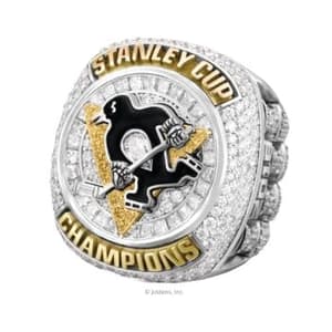
- 2016 Pittsburgh Penguins
DISCLAIMER: as previously mentioned, my buddy was on this team and I’ve worn this ring a few times. But that being said, it’s just a really nice ring. I think what makes this one better than the one that followed it is the blackness of the penguin. It pops a bit more than the 2017 version where the bird blends into the background too much. Just a simple, clean ring with good shape and size and nothing negative that stands out.
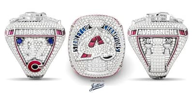
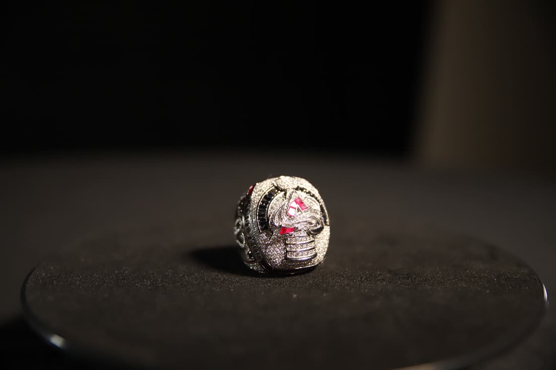
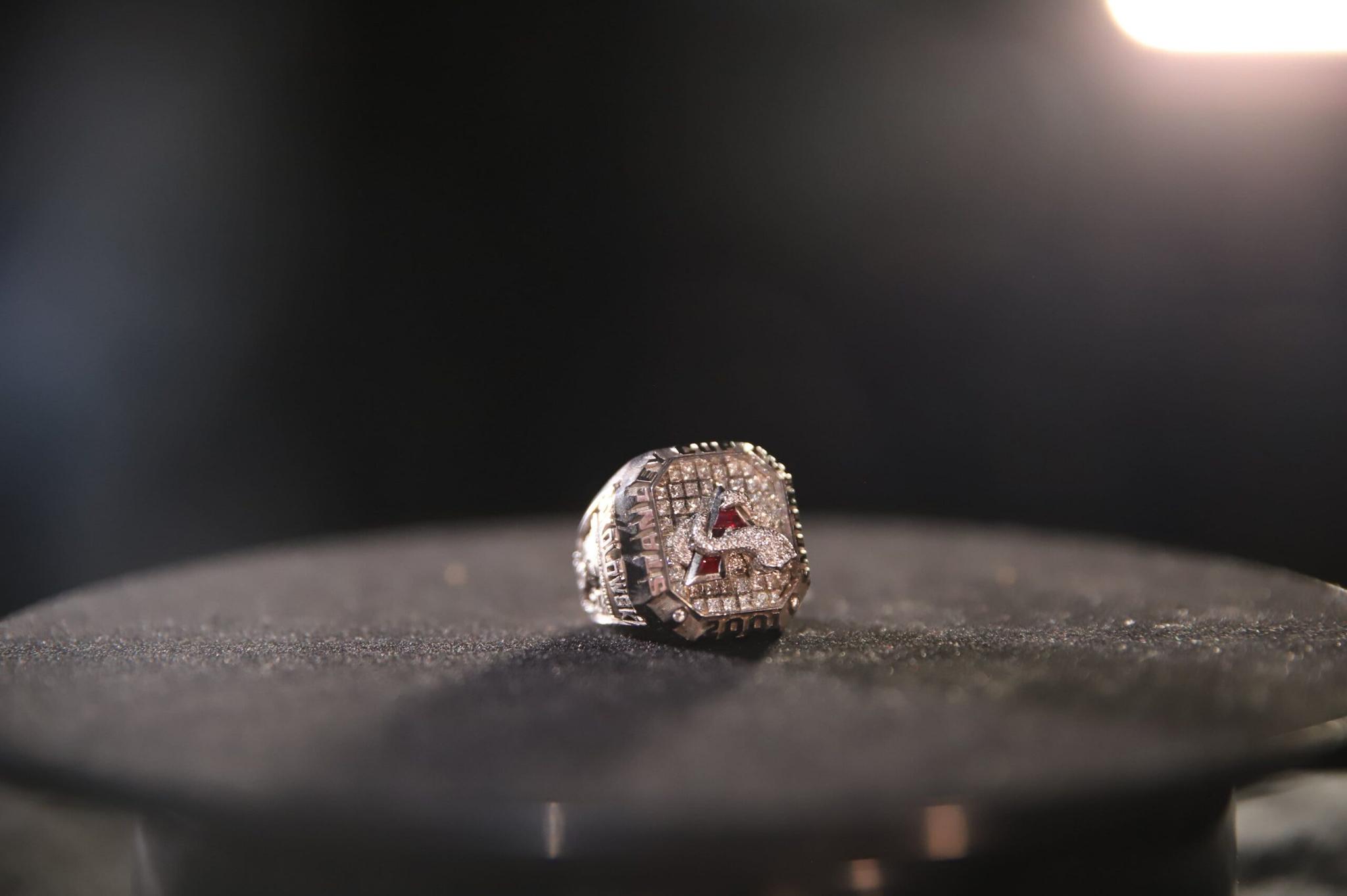
- 2022 Colorado Avalanche
Ohhhhh, you thought because I love the Avalanche that I would blindly assign them the top spot. That my recency bias and undying love for the organization would leave me no choice but to give it top spot… WRONG! I’m a man of integrity when it comes to these rankings and this ring is not the best. Don’t get me wrong, it’s a great ring. I think it’s beautiful and I welcome any of you to buy me one of the replicas that the Avalanche and Jostens are selling (size 11), but I’m a straight shooter. My initial reaction to it last night was very middle of the road. ‘Meh’ if you will. But as I continued to look at the photos posted and read what the team released about it, I was won over. You put the 19 stones on the ‘Snowy A’ to honor my best friend Joe Sakic? Uhhhhhh… yeah that’s awesome. My only knock on it — which cost it at least one spot in these rankings — is the lack of blue in the logo. I get they needed space for the ‘Sakic Stones,’ but its lack of blue and inclusion of the maroon in the rubies seems off. I think it was even more of an omission for me since the team basically adopted blue as a more prominent part of the brand with the elimination of all black from the equipment.The blue falls behind the ‘Stanley Cup Champions’ text, but I would’ve loved to see some of it in the logo. How about that box, though?! The presentation of the ring as a whole is the best of the decade… hands down.
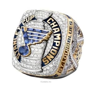
- 2019 St. Louis Blues
Look… I’m not happy about this either. On so many levels, I hate myself for this. But real talk: these are awesome rings. The Cup, the logo, the gold/colors of everything… it’s a great ring. The markings on the side with the musical notes, the arch and the lyrics to Gloria are all awesome. Had Colorado used an “All the Small Things” reference somewhere in theirs, I think I would’ve bumped it up to No. 2, but it was hard for me — even with my unabashed homerism — to move it ahead of this ring that the Blues franchise waited so long for.
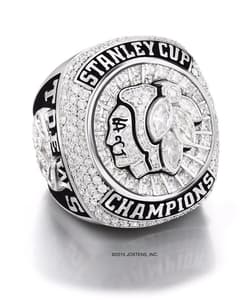
- 2015 Blackhawks
I don’t know why I love this ring as much as I do… I just do. My face was basically the emoji with the hearts on the eyes when I saw it. It’s simple. It’s clean. It’s basically monochromatic. It’s awesome. And I didn’t put it at No. 1 because the Hawks also beat the Lightning, that’s just an added bonus. This is just the ring that when I was looking at all of them seemed perfect to me. I have no issues with it. Like the Avalanche, Chicago has a complicated logo that can be tough to make look good on a small surface like a championship ring. This is a perfect example of how to successfully accomplish that. The last of the Blackhawks’ dynastic run, this is their best ring and, in my opinion, the best of the last 10 years.
COLORADO STANLEY CUP RINGS RANKINGS!
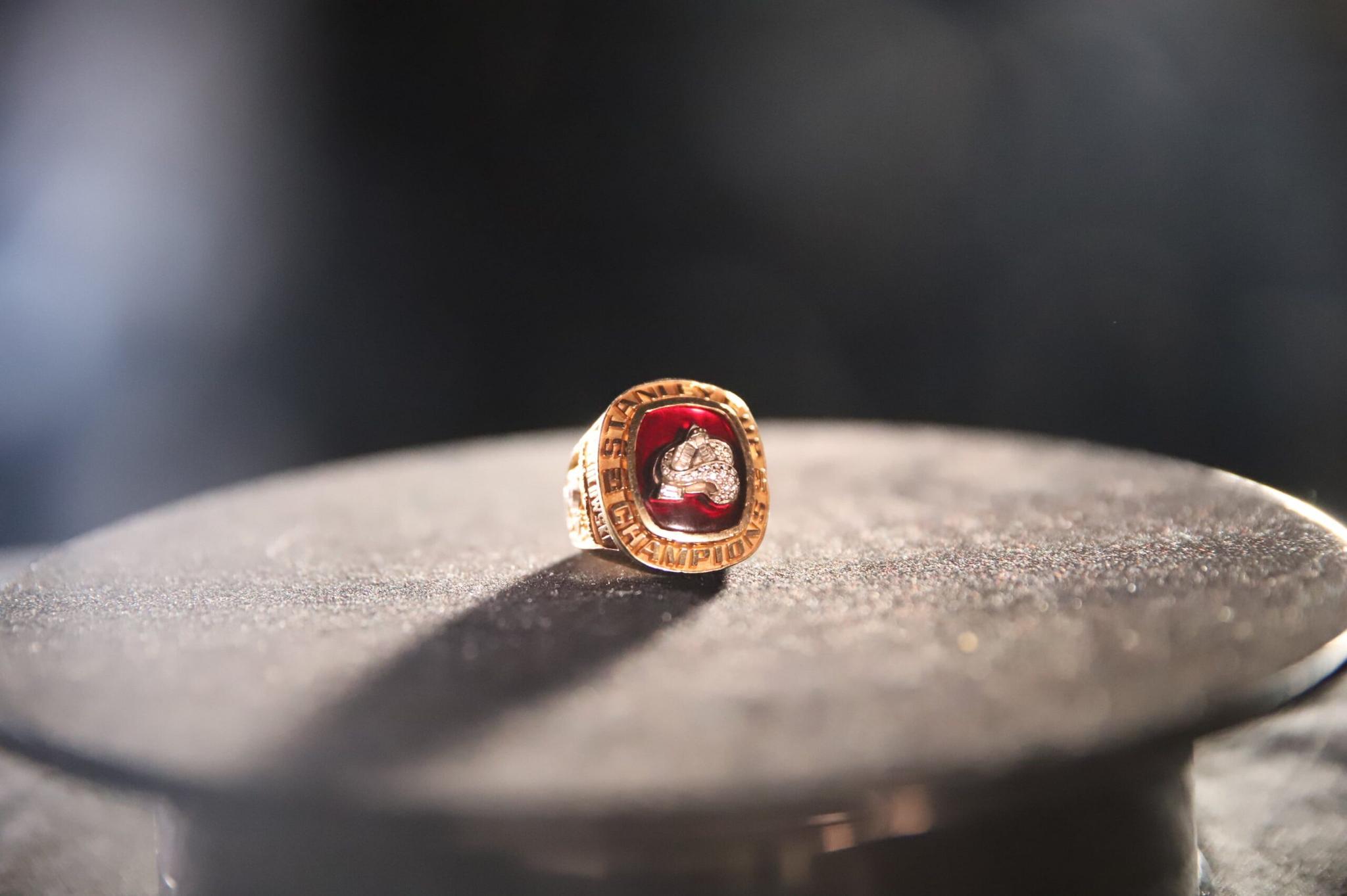
- 1996
Yikes… time is not friendly to these. The all-gold look was big in the 90s. So was the Macarena. I loved that 1996 team, but this is clearly from a different era of championship rings. It is hard to view it in any other lens than that of the present when players get rings that are nearly as big as the pucks they play with.
- 2001
Better. Not the best. But better than the previous version. Until this year, that team was the most revered in franchise history and this ring was a step in the right direction. The move to white gold was the right play and the logo’s design with cascading diamonds is a considerable step up from its predecessor.
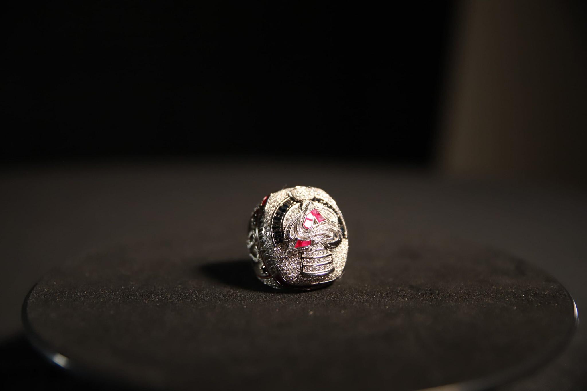
- 2022
RECENCY BIAS! RECENCY BIAS! Not really. Anyone who looks at these three and doesn’t think this year’s version is the best by a mile needs to see a doctor. It’s a great ring. My knock on it is that the logo seems off because it lacks the blue. Compared to the two that came before it, the Avs logo on this year’s version is a 4K television against the old push-button TV my parents had in our kitchen growing up. This is the best Avs ring by a mile.
There you have it. My rankings of rings I had no say in designing with no qualifications to judge the work of world-class jewelers.
Coming soon… banner rankings! I can’t wait to see the 2022 banner up there with its brothers so I can judge which one is the prettiest!
Enjoy opening night and all the pomp and circumstance, everybody. As fans of certain teams, we don’t get nights like this too often, so soak it in and celebrate 2022 one more time before we finally ‘turn the page.’